Cher Jimenez
By CHER JIMENEZ
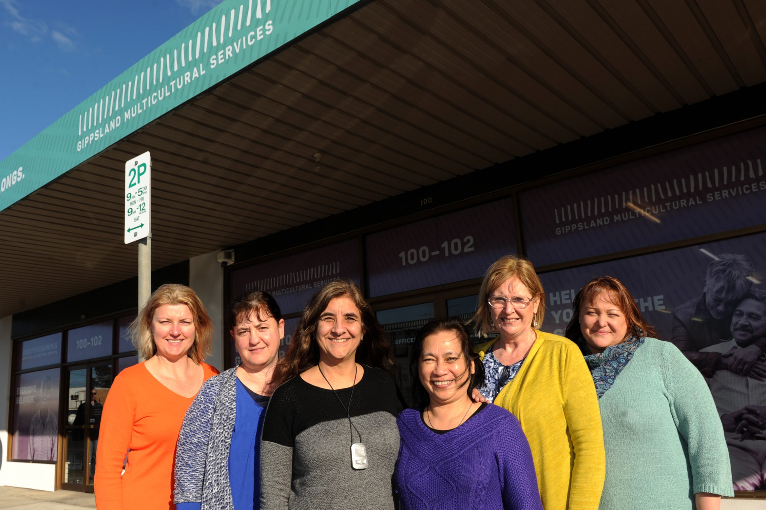
The Gippsland Multicultural Services launched its new look last week to rebrand itself after more than 30 years as the region’s peak migrant body.
GMS chief executive officer Lisa Sinha said discussions about rebranding the organisation’s image were taken up last year by its board with a Traralgon-based graphic image company tapped to make the new design.
At first glance one would wonder what a series of sticks had to do with an organisation that was locally known to support migrants and refugees.
Ms Sinha admitted that she had reservations about the new design in the beginning but later on saw that “it started to make sense” and reflected what GMS was all about.
“The new design had a set of lines which looks pretty ordinary at a glance but every stick is different. No stick is the same as the other [and] tells you that each person is unique,” she said.
Ms Sinha said they had their old logo since GMS was formed in 1984 so “it’s time for a new look that reflects what we’re all about”.
She said the design and the five colours used in their website and stationery materials summed up the organisation’s role that “we welcome and value and respect each person as unique – everyone belongs”.
Ms Sinha said the GMS rebranding was partly a response to the changing environment where they hoped to be relevant to a wider audience and not just to older migrants and new arrivals.
“It opens up the idea that what we’re doing well might apply to you no matter who you are whereas we might have been thought of only for older migrants or only for new arrivals … [it’s] developing the service to suit the person not the person to suit the service,” she said.
Ms Sinha said the new GMS website would also be user-friendly, more modern and easy to navigate. For further information, visit gms.org.au.


